 科技微讯
科技微讯深入理解 Flexbox
An Interactive Guide to Flexbox
这篇文章较为深入地解释了 Flexbox 的工作模式和使用方法,文章提到了几个我不太熟悉的知识点:
gap:每个 item 之间的间距,我之前一直用margin,但一旦 wrap,每一行的第一个或最后一个 item 会出现多余的间距,gap可避免这个问题;align-self:align-items用在 Flexbox 的 container 中,而align-self用在每一个 item 中,事实上我们可以把align-items看成是align-self的 shorthand,在 container 中使用了align-items,然后在某个 item 中使用align-self,可对这个 item 单独设置不同于其他 item 的对齐方式,要注意的是justify-self在 Flexbox 中无效;- Hypothetical size:Flexbox 中的 item 其
width属性可能不会被严格执行,因为这时候的宽度是 hypothetical(假设)宽度,height也是,设置flex-wrap: wrap可暂时避免尺寸被压缩到低于假设值; flex-basis:类似width或height,但如果同时设置了width或height,flex-basis优先,flex-basis的意思是在flex-shrink或flex-grow时,是在flex-basis设置的值开始压缩或伸展的,只作用于 primary axis 这个方向;
In a Flex row,
flex-basisdoes the same thing as width. In a Flex column,flex-basisdoes the same thing asheight. It's likewidthorheight, but pegged to the primary axis, like everything else. It allows us to set the hypothetical size of an element in the primary-axis direction, regardless of whether that's horizontal or vertical.
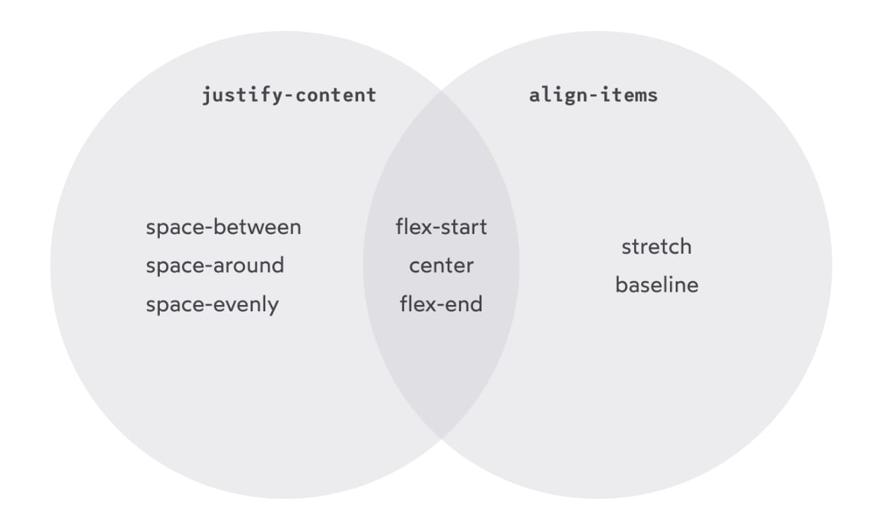
- content 和 items:这两个单词其实可以顾名思义,content 是一个包括了多个 item 的整体,items 指的是每一个 item;所有位于 primary axis 中的元素统称 content,垂直于 primary axis 的元素都是 item,正是这种区别,
align-items和justify-content的值才不完全相同,也正因为这个原因justify-self、justify-items在 Flexbox 中无效;
-
margin: auto:可在某个 item 中使用margin: auto、margin: auto 0、margin: 0 auto使该 item 上下左右居中显示; -
align-content:主要用在flex-wrap: wrap的情况下,align-items是对同一行中的 item 进行设置,而align-content其实是把每一行分别看作一个整体 item(这个整体 item 包括了多个 item,所以也叫 content)再align-items,所以align-content可能的值和align-items是一样的; -
min-width:一些 html 元素有浏览器赋予的默认最小尺寸,比如 text input 默认的最小宽度是 170px ~ 200px(不同浏览器之间不同),flex-shrink不会无限压缩这些元素的尺寸,于是可能出现 overflow,对于这些元素,设置min-width: 0即可避免 overflow;
总结以下几个容易混淆的属性:
align-items:作用于每一个 item,在垂直于 primary axis 的方向上布局,可看作是align-self的 shorthand;align-content:主要搭配flex-wrap: wrap使用,把每一行当作一个 item 进行布局;align-self:类似align-items,但用在某个 item;justify-content:在 primary axis 方向上布局;justify-items:在 Flexbox 中无效;justify-self:在 Flexbox 中无效;place-items:justify-items和align-items的 shorthand;place-content:justify-content和align-content的 shorthand;
相关笔记:
- 使用 margin:auto 居中 flex 元素:使用
margin:auto居中元素还有一个额外好处,可避免被居中的元素显示不完整; - CSS 对内容进行居中的几种方法:这篇文章提到了使用
place-items、place-content居中元素;
 赞赏
赞赏 0
0 0
0