 科技微讯
科技微讯如何自定义 radio input 的样式?
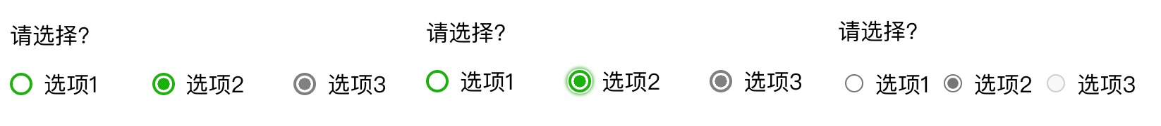
radio 按钮的默认样式并不好看,它在不同浏览器上的默认外观也不一样,且尺寸不能根据 label 的字体大小进行自适应。这篇文章记录我学习到的自定义 radio 样式的方法,以下图为例:
代码
上图有 3 组 radio 按钮,第一第二组都是自定义样式,中间那个按钮分别是没有 focus 和被 focus 的按钮,第三组是 radio 的默认样式,方便大家对比效果。
代码如下:
<html lang=en>
<style>
  :root {
    --color: rgb(27,178,10);
  }
  *,
  *:before,
  *:after {
    box-sizing: border-box;
  }
  .radio_title {
    font-size: 1em;
  }
  .radio_container {
    display: grid;
    grid-template-columns: repeat(auto-fill,minmax(100px,1fr));
  }
  .radio {
    display: grid;
    grid-template-columns: min-content auto;
    grid-gap: 0.5em;
  }
  .radio_input {
    display: flex;
  }
  .radio_input span {
    width: 1em;
    height: 1em;
    color: var(--color);
    border: 0.1em solid currentColor;
    border-radius: 50%;
  }
  .radio_input input {
    width: 0em;
    height: 0em;
    opacity: 0;
    position: absolute;
  }
  .radio_input input:checked+span {
    background: radial-gradient(currentcolor 50%,rgba(255,0,0,0) 51%);
  }
  .radio_input input:focus+span {
    box-shadow: 0 0 0 0.05em #fff,0 0 0.15em 0.1em currentColor;
  }
  .radio_input input:disabled+span {
    border: 0.1em solid grey;
    background: radial-gradient(grey 50%,rgba(255,0,0,0) 51%);
  }
  .radio_text {
    line-height: 1;
  }
</style>
</head>

<body>
  <p class="radio_title">请选择?</p>
  <div class="radio_container">
    <label class="radio">
      <span class="radio_input">
        <input type="radio" name="radio" />
        <span></span>
      </span>
      <span class="radio_text">选项1</span>
    </label>
    <label class="radio">
      <span class="radio_input">
        <input type="radio" name="radio" />
        <span></span>
      </span>
      <span class="radio_text">选项2</span>
    </label>
    <label class="radio">
      <span class="radio_input">
        <input type="radio" name="radio" disabled />
        <span></span>
      </span>
      <span class="radio_text">选项3</span>
    </label>
  </div>
</body>

</html>
解释
:root
:root 选择器相当于 html 选择器,区别是前者的 specificity 更高。
--
可以通过 --* 自定义 css 变量,这个变量对应的其值可以通过 var() 用在其他地方,但只能用在声明这个变量的元素及其子元素之中,可以这样用:
:root {
  --somecolor: grey;
}
min-content
min-content 可以用来定义一个元素的高度和宽度,表示尽量缩小这个元素的高度和宽度,直到这个元素刚好没有产生 overflow,其明确的定义是:
The smallest size a box could take that doesn’t lead to overflow that could be avoided by choosing a larger size.
注意 "overflow that could be avoided by choosing a larger size" 这句话,所以上面那句话应该更改为: 直到这个元素刚好没有产生可以通过增加这个元素的尺寸就可以避免的 overflow,如果在这个元素添加 overflow: auto 或在其父元素添加 overflow: auto,那这个元素并不会为了避免这种 overflow 而改变它的宽度或高度。
max-content
max-content 用来设置元素的宽度,意思是: 给予该元素无限延伸宽度的自由,在不产生多余的宽度的情况下,该元素所能占据的最大宽度,其明确定义如下:
A box’s “ideal” size in a given axis when given infinite available space. Usually this is the smallest size the box could take in that axis while still fitting around its contents,i.e. minimizing unfilled space while avoiding overflow。
"when given infinite available space" 是关键,所以这个元素的宽度可能会超过其父元素的宽度,如果父元素设置了 overflow: auto,该元素的宽度虽然会超过父元素的宽度,但会在水平方向上 overflow,所以布局上不会突破父元素的范围。
currentColor
currentColor 是 css 的一个变量,它的值是当前这个元素的 color 属性的值,如果当前元素没有 color 属性,就找父元素,如果父元素也没有,再找父元素的父元素,一路找上去。
background
radio 被选中的样式是通过 background 属性设置的,在默认的打印设置下,css background 不会被打印出来,如果要显示 css background,打印前只要进行简单的设置即可:
总结
<input type='radio'> 的样式其实并不能直接自定义,思路是把它隐藏了,通过自定义 <span> 元素的样式模拟它的外观。同时由于 <input> 被隐藏了,:focus、:checked、:disabled 的效果将看不到,于是需要借助 input:checked+span 这种选择器选中 span 元素,对 span 元素设置这些状态。
参考资料: