 科技微讯
科技微讯CSS 对内容进行居中的几种方法
flex box 居中
align
align-content: center、align-items: center:当设置 display:flex; flex-direction: row 时,中点是这个 element 的中心,main 线是水平线,cross 线是垂直于 main 线的线。
align-content:把 flex box 中的所有内容(即 content)作为一个整体,把它上下居中显示在穿过中心的 cross 线上,它只有当这个 flex box 同时设置了 flex-wrap: wrap 才有效。
align-items:把 flex 元素中的每一个一级子元素分别当作一个元素(即 item),把这些元素居中显示在其所在的 cross 线上。
justify
justify-content: center、justify-items: center:前者把 flex box 中的所有内容(即 content)当作一个整体,放在 main 线的中间,后者不适用于 flex box,所以用在 flex box 中无效,它通常用在 grid box 中。
如果一个子元素的 width 大于其父元素的 width,如何把子元素水平居中在父元素中呢?方法是把父元素变成一个 flex container 并使用 justify-content: center,然后在子元素使用 flex-shrink: 0。
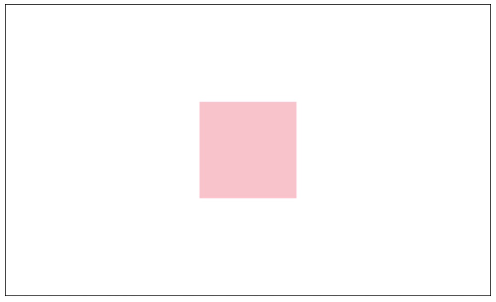
margin: auto
上面提到的 align- 和 justify- 都是作用在 flex box 这个 container 中,另一个让 container 中的子元素居中的方法,是把 align- 和 justify- 从 container 中删除,然后在子元素中添加 margin: auto。
当子元素的长或宽比 container 大时,在 container 使用 align- 和 justify- 可能会让子元素显示不全,margin: auto 可解决这个问题。
<html>
  <head>
    <style>
      .parent {
        border: 1px solid black;
        width: 500px;
        height: 300px;
        display: flex;
      }
      .child {
        margin: auto;
        background-color: pink;
        width: 100px;
        height: 100px;
      }
    </style>
  </head>
  <body>
    <div class="parent">
      <div class="child"></div>
    </div>
  </body>
</html>
place
place-items 和 place-content 分别是 justify-items & align-items 和 justify-content & align-content 的 shorthand,所以如果 place-content 用在 flex box 中,并希望实现 align-content 的作用,需要在 flex box 使用 flex-wrap: wrap。
<html>
  <head>
    <style>
      .parent {
        border: 1px solid black;
        width: 500px;
        height: 300px;
        display: flex;
        flex-wrap: wrap;
        place-content: center;
      }
      .child {
        background-color: pink;
        width: 100px;
        height: 100px;
      }
    </style>
  </head>
  <body>
    <div class="parent">
      <div class="child"></div>
    </div>
  </body>
</html>
grid box 居中
<html>
  <head>
    <style>
      .parent {
        border: 1px solid black;
        width: 500px;
        height: 300px;
        display: grid;
        place-items: center;
      }
      .child {
        background-color: pink;
        width: 100px;
        height: 100px;
      }
    </style>
  </head>
  <body>
    <div class="parent">
      <div class="child"></div>
    </div>
  </body>
</html>
其他
position: absolute
在父元素使用 position: relative,然后在子元素使用:
.center-element {
  position: absolute;
  top: 50%;
  left: 50%;
  transform: translate(-50%, -50%);
}
在 transform: translate() 中使用的百分比是相对元素自身 width、height 的百分比,而 top、left 都是相对父元素 width、height 的百分比,这几个百分比结合起来的意思是:
- 子元素顶部放在父元素中间的位置;
- 子元素最左边放在父元素中间的位置;
- 子元素往上挪自身高度的 50%;
- 子元素往左挪自身宽度的 50%;
于是子元素就把自己给居中了。
关于百分比在 CSS 的意思,可以看这篇文章:《What does 100% mean in CSS?》
vertical-align
这个 css 属性用在需要居中显示的那个元素中,而不是其父元素,但要注意父元素的 line-height,默认情况下 line-height 的值是 normal,vertical-align 的作用是在父元素的 line-height 中上下居中,如果 line-height 等于需要居中的元素的高度,会看不到效果。
normal 的意思是:
Depends on the user agent. Desktop browsers (including Firefox) use a default value of roughly 1.2, depending on the element's font-family.
注意 vertical-align 只能应用于 inline 元素、inline-box 元素、 table-cell 元素。
参考资料:
- 10 modern layouts in 1 line of CSS
- 深入理解 Flexbox
- flexboxcss:一个直观展示 Flexbox 各属性的小工具;